DTF artwork preparation is the bridge between your creative vision and a flawless direct-to-film transfer, setting the tone for every garment you print. Starting with the right color space, resolution, and file structure helps ensure print-ready artwork for DTF remains crisp as it moves through the production chain, reducing surprises downstream. Following practical DTF printing guidelines minimizes misprints, color drift, and wasted materials while keeping the overall workflow predictable, repeatable, and scalable across runs. Prepare your layers with clear separations and mindful typography so you meet the color separation for DTF requirements, maintain strong opacity on darker fabrics, and keep fine details legible at final print size. With a steady foundation in DTF design tips and a clear view of the direct-to-film printing workflow, your designs translate from screen to fabric with vibrant color, durable detail, and a consistent result you can reproduce.
In other words, the prepress stage for film-based transfers shapes how visuals perform on fabric, long before ink meets film. This phase acts as a blueprint for color fidelity, layer sequencing, and printability, and it embraces concepts like preflight checks, color management, and RIP-driven separations. By thinking in terms of transfer-ready preparation, film-to-fabric workflow, and color separation for DTF within a broader semantic context, designers can plan for consistency across batches. The goal is a repeatable process that translates on-screen intent into accurate, vibrant results on real garments through careful testing and iteration.
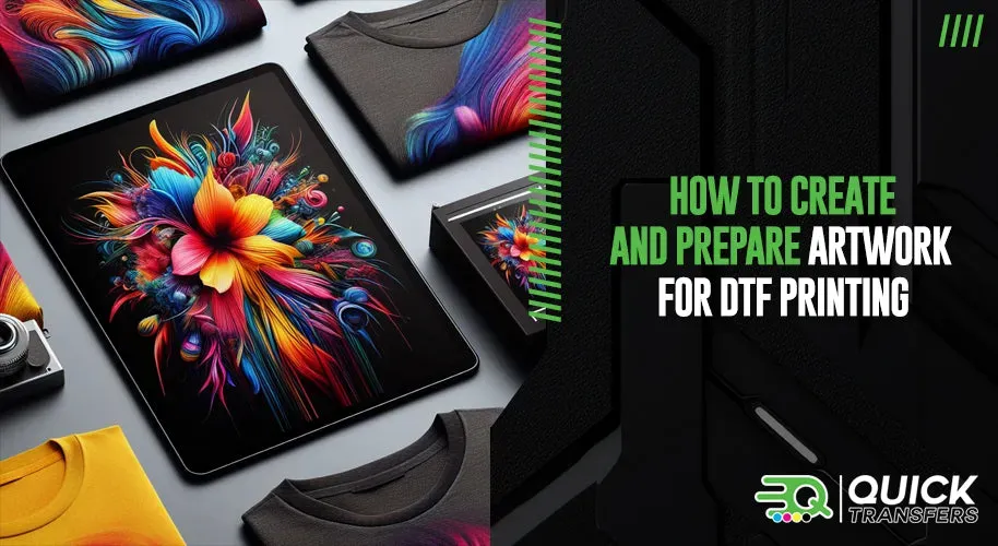
DTF Artwork Preparation: From Concept to Print-Ready Files
DTF artwork preparation is the critical bridge between your creative concept and a flawless direct-to-film transfer. It’s not just about making something look good on screen—you’re shaping color, density, and layering so the design survives the film, powder, and heat steps that follow. Adhering to established DTF printing guidelines helps you predict outcomes, reduces misprints, and sets a reliable baseline for multiple runs.
To achieve print-ready artwork for DTF, start with a clear plan for color strategy, resolution, and file structure. This means organizing layers for separations, choosing print-friendly color groups, and considering how the artwork will sit on different fabrics. With deliberate preparation, you’ll translate your vision into a durable, vibrant transfer that performs consistently across garments and batch sizes.
Understanding the Direct-to-Film Printing Workflow for Accurate Color
The direct-to-film printing workflow encompasses design, file preparation, color management, film printing, powder coating, and heat transfer to fabric. Each stage offers opportunities to optimize results, but the upstream artwork work has the biggest impact on color fidelity and detail after transfer. Focusing on the early steps helps ensure what you see on screen becomes what you get on the garment.
Set practical goals for each project by considering the base fabric color, garment type, and intended audience. Dark fabrics require opacity planning and strategic layering, while light fabrics can tolerate subtler color blends. Aligning these constraints with your DTF design tips makes the workflow smoother and improves consistency when moving from design to print.
Color Management and Color Separation Strategies for DTF
Color management starts with choosing the right color space and embedding profiles so your screens and RIPs translate colors predictably. Color separation for DTF is the heart of this process, as you map digital hues to separate film layers that will be printed, cured, and transferred. Thoughtful color management reduces drift between on-screen previews and final results.
Develop practical separation strategies by balancing bold blocks with gradients. Fewer color separations with solid ink deposits work well for crisp graphics, while more granular separations may be needed for photographic elements. Always account for halftone patterns and spot colors, ensuring that overlays align with the intended print sequence to avoid muddy results.
Preparing Print-Ready Artwork: Resolution, Formats, and Bleed for DTF
Aim for high-resolution artwork, typically 300 DPI at the final print size, to minimize pixelation when the film is scaled during printing. Use print-safe formats like TIFF or PNG for each color layer, or keep layered PSD/PSB when your RIP supports it. Carry color profiles across files and include bleeds to ensure the final trim doesn’t reveal unwanted edges.
Export and packaging decisions matter just as much as the design itself. Flattened exports should retain color integrity and transparency, while layered files help with future edits. Verify that the file’s color profile matches your RIP settings, and plan for how this artwork will transition through the DTF workflow so you can preserve the designer’s intent in the final product.
Layering, Separation and Typography: Structuring DTF Artwork
Layering is the backbone of DTF artwork preparation. Build a clean, logically named layer structure that maps to color groups and separations, making color separation for DTF easier and more reproducible. Clear separation planning reduces misregistration risks and helps technicians anticipate how each film layer will interact in the final transfer.
Typography and readability matter drastically on film. Outline fonts whenever possible or embed vector outlines to prevent substitutions. Ensure critical details stay within safe zones to account for garment curvature, while maintaining legibility on press-ready layouts.
Practical Workflow and Quality Control for DTF Artwork
A practical workflow keeps your DTF projects predictable from concept to finished garment. Start by defining the target garment and fabric color, then create a structured layer setup, establish color separations, and convert text to outlines. Embed or convert color profiles early, and run soft proofs to verify alignment before printing.
Quality control is a non-negotiable step. Check for alignment across color layers, confirm final print size matches garment dimensions, and inspect edges for halos or bleed areas. Run small test prints to confirm color accuracy and opacity, then adjust separations or layer order as needed to align with the direct-to-film printing workflow and the brand’s DTF printing guidelines.
Frequently Asked Questions
How does DTF artwork preparation influence the direct-to-film printing workflow?
DTF artwork preparation defines the upstream steps of the direct-to-film printing workflow, including the target garment, base fabric color, and how layers are organized. It ensures color management, bleed, and file setup align with film printing, powder coating, and heat transfer, reducing misprints and wasted materials. Practically, define goals, build clean layers, plan color separations, run test proofs, and coordinate with your RIP and transfer process.
What constitutes print-ready artwork for DTF, and how do color profiles impact DTF printing guidelines?
Print-ready artwork for DTF means high-resolution files with proper bleed, embedded or translated color profiles, and well-organized layers ready for color separation. In practice, start in RGB for on-screen work but be prepared for CMYK or RIP-based translation; embed color profiles and anticipate color shifts during conversion as part of DTF printing guidelines.
How should color separation for DTF be planned as part of DTF artwork preparation to maintain color accuracy?
Plan color separation for DTF by defining primary color groups and assigning them to separate film layers, keeping layer order aligned with the print sequence. Use a mix of one-to-one and tonal separations as needed, and consider halftones or micro-dots for gradients to preserve detail. Test separations and adjust to prevent color crosstalk and muddy results.
What are essential DTF design tips to consider during DTF artwork preparation?
DTF design tips emphasize bold contrasts and readable silhouettes, especially since film transfers reproduce shapes more reliably than fine textures. Consider the base garment color and texture when selecting colors, and plan for opacity on dark fabrics to avoid washout. Keep file sizes manageable and ensure critical details stay within safe areas to accommodate garment curvature.
What file formats and resolution settings should you use in DTF artwork preparation to ensure print-ready artwork for DTF?
Aim for 300 DPI at the final print size to preserve detail. Use print-safe formats like TIFF or PNG for each color layer, or preserve layered PSD/PSB if your workflow supports it. Embed or sync the color profile with your RIP settings and include bleed to prevent white edges at trim.
What common pitfalls should you watch for during DTF artwork preparation and how can you prevent mis-registration and color drift in the direct-to-film printing workflow?
Common pitfalls include color drift between design and print, halos around edges, blurred fine details, and mis-registration on transfers. Prevent these by keeping a printed color reference, implementing adequate bleed, testing color separations with proof prints, and ensuring correct layer order and alignment with the transfer process (powder coating, curing, heat press). Regular documentation of workflow settings also helps reproduce consistent results.
| Aspect | Key Points |
|---|---|
| Purpose of DTF artwork preparation | Bridges creative vision and direct-to-film transfer to achieve crisp details, vibrant colors, and durable prints across fabrics. Prepares artwork for the entire DTF workflow from concept to finished garment. |
| DTF workflow overview | Design → file preparation → color management → film printing → powder coating → heat transfer to fabric. Upstream artwork prep determines transfer behavior and on-fabric result. |
| Design considerations | Focus on color mode (RGB on screen; CMYK or RIP profiles in print), layering and separations, typography readability (outline or embedded fonts), bleed/safe areas, and handling transparency to avoid halos. |
| Color management & separation basics | Define primary color groups for film layers; balance one-to-one vs tonal separations; use halftones/dots for gradients; plan spot colors and overlays to align with print sequence. |
| File preparation | Aim for 300 DPI at final print size; use TIFF/PNG for color layers or preserve layered PSD/PSB; ensure consistent color profiles; include bleed/margins and manage opacity/blending for film transfer. |
| Practical workflow steps | 1) Define garment color 2) Organize layers 3) Set up color separations 4) Convert text 5) Embed color profiles 6) Proof at print size 7) Run test proofs 8) Align with transfer process (powder, cure, heat press) to maintain consistency. |
| Common pitfalls | Color drift between design and print; blurred details; white edge halos; mismatches on dark fabrics. Mitigate via references, appropriate line weights, and opacity planning. |
| Real-world tips | Start with a solid brief and pilot run; document workflow and settings; communicate with printer/RIP tech to preempt machine quirks. |
| DTF design tips | Use bold contrasts and readable silhouettes; choose color palettes tuned for DTF film; plan for garment color/texture; keep file sizes manageable; flatten non-editable layers when appropriate. |
| Quality control | Check alignment across layers, verify final print size, inspect halos/bleeding, and run small test prints to adjust colors, opacity, or layer order before full production. |